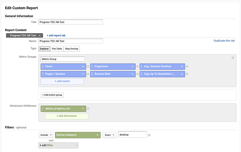
Since this table of contents only appears on desktop screens, I'll create a custom report in GA that cuts the data by the AB test, and also filters the results down to Device=Desktop:
Side note: Anybody have any idea how I can make a table of contents also work on mobile?
Google Analytics Custom Reporting
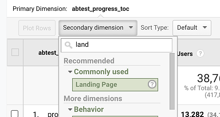
Once, I'm in the report, I'll put another dimension in called "Landing Page" because I want to look at the metrics at the page level and for users that landed on that page (usually from Google Search).
How to drill down to specific landing page.
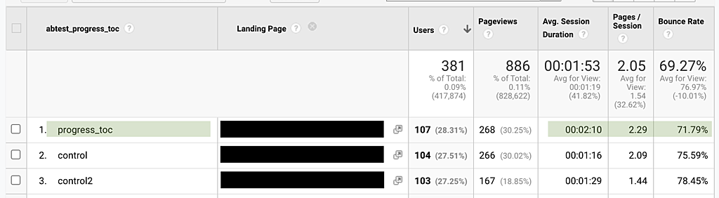
Results
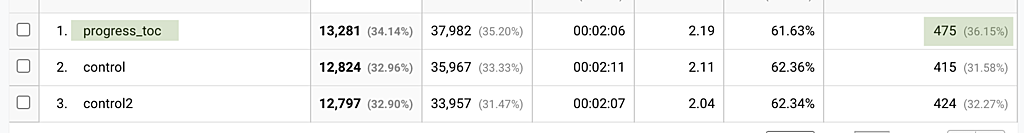
The table of contents performed significantly better than the control group in terms of time on site.
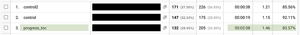
For this test I ran two control groups, control and control2, so only 33% of users saw the table of contents.
It's so obviously better that I don't even need to plug the data into an AB test calculator.
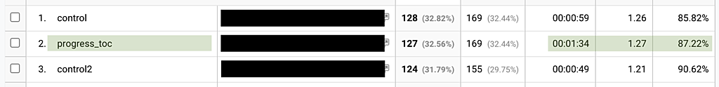
Here are the results for three popular pages on Starter Story:
2x time on site, more pages, lower bounce rate
1.5x time on site, no change in pages or bounce rate
4-5x increase in time on site, more pages, better bounce rate
As a whole, it also increased the likelihood to subscribe to the Starter Story email list, which was an unexpected benefit: